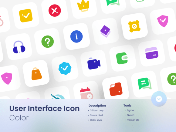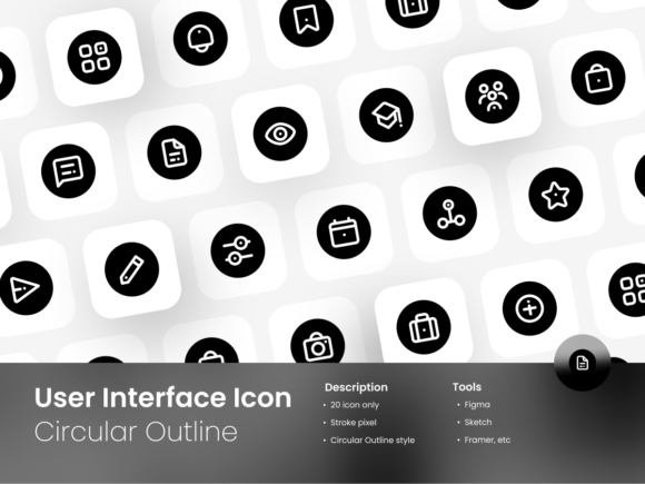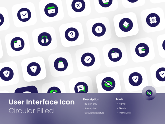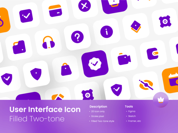
User Interface Icon Set Outline Style: Elevating Design with Precision
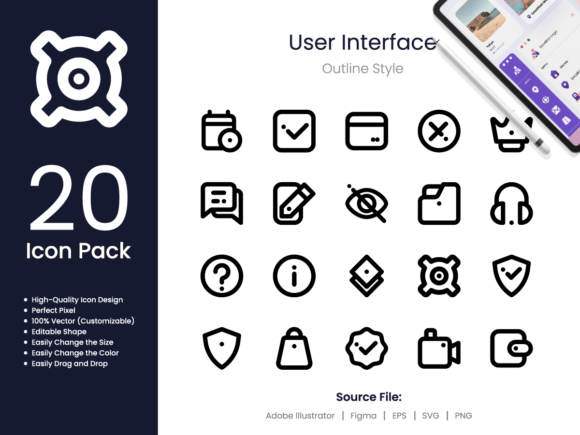
In digital design, clarity and consistency are foundational. A clean set of visual elements can dramatically improve user comprehension and the aesthetic appeal of any project. The User Interface Icon Set Outline Style offers precisely that—a curated collection of 20 interface-focused icons rendered in a crisp outline format. For creators, this pack provides versatile assets for applications ranging from websites and mobile apps to presentations and print media. However, the true value isn't just in downloading the files; it’s in understanding how to integrate them effectively into your workflow to avoid common, yet often subtle, pitfalls that can undermine your design's professionalism.
The Misunderstanding of "High-Quality" in Icon Design
Many designers see "high-quality icon design" and "perfect pixel" listed as features and assume this means the icons will automatically look perfect in any context. This is a critical oversight. These terms refer to the technical construction of the assets—they are vector-based, scalable without loss of detail, and meticulously crafted. The mistake occurs when users place these icons into a project without considering the overall visual system. An icon might be pixel-perfect, but if its stroke weight is drastically thinner or thicker than other lines in your design, it will look alien and disjointed. The quality of the individual asset is only one part of the equation; its harmonious integration defines the final outcome.
A better approach is to treat these icons as a foundational component, not a finished decoration. Before applying them, audit your project's existing visual language. What is the standard line thickness? What is the level of detail complexity? Use the customizable features of the User Interface Icon Set Outline Style—the editable shapes and easily changed sizes and colors—to align the icons with your system. For example, if your website uses 1.5px strokes, adjust the icon strokes to match. This proactive matching turns a generic asset into a bespoke part of your design.
Overlooking the Implications of File Format Choices
The pack includes source files in Adobe Illustrator, FIGMA, EPS, SVG, and PNG. A common mistake is to immediately grab the PNG files because they seem the easiest to "drag and drop." For quick, one-off use, this might be fine. But for any scalable, professional project, using PNGs locks you into a fixed resolution. If you need to adjust size for a different screen or print medium later, you'll encounter blurry edges or pixelation, sacrificing the "perfect pixel" advantage you paid for. This is especially problematic for entrepreneurs and marketers creating materials that might need to scale from a mobile banner to a conference poster.
The practical advice is to always start with the vector source files (AI, FIGMA, EPS, SVG) for primary design work. The SVG format, for instance, is ideal for web and app development as it scales infinitely and remains crisp. Use the PNGs only for final exports in specific, fixed-size scenarios, or for software that doesn't support vectors. By understanding the strength of each format—vectors for editing and scaling, PNGs for fixed placement—you leverage the full utility of the User Interface Icon Set Outline Style and future-proof your designs against resizing needs.
The Trap of Inconsistent Application Across Media
The promotional text rightly states these icons are useful for "websites, mobile apps, social media, presentations, flyers, print, banners, and posters." This breadth can lead to a scattered application mistake. A blogger might use the same icon set on their website, their Instagram graphics, and their downloadable PDF guide, but without establishing a consistent rule set for color and size, the brand presence feels fragmented rather than unified. The icons become recognizable, but not cohesively so.
To avoid this, establish a simple style guide for the icon set before deployment. Decide on a primary color palette (using the easy color change feature) and two or three standard sizes for different contexts. For instance, use 24px for UI elements on your app, 48px for social media profile highlights, and 80px for poster headings. This disciplined reuse creates a strong, recognizable visual thread across all user touchpoints. The User Interface Icon Set Outline Style becomes a tool for brand cohesion, not just a collection of pretty graphics.
Underestimating the Need for Contextual Evaluation
Before committing to any icon set, professionals should evaluate it against their specific project needs. A frequent error is downloading a set based on a stylish preview without checking if it contains the actual functional icons required. This outline style pack is themed for user interfaces, meaning it likely includes symbols for common actions like settings, search, user profile, and download. But if your project needs a very specific icon, like "data merge" or "multi-layer filter," this general set might not suffice, leading to a gap you must fill elsewhere, breaking visual consistency.
Always review the full list of 20 icons provided. Does it cover the core functions of your interface? Can the editable shapes be modestly altered to represent a unique need? Sometimes, a "notification bell" icon can be adapted into an "alert flag" with minor shape editing. This pre-purchase or pre-use evaluation ensures the set serves as a solid core, reducing the need to mix in icons from disparate sources, which often results in a visually jarring experience for the end-user.
Final Checks for a Successful Integration
To make the most of a User Interface Icon Set Outline Style, a few final, constructive checks are essential. First, verify your software compatibility. You get FIGMA and Illustrator files—are you using those tools, or can your software import EPS or SVG? Second, remember the note that mockups and photos are not included. The icons are the raw assets. Their power comes from your application, not from pre-made scenes. Third, consider the long-term. Is this a style you can maintain? Outline icons are modern and clean, but they need to fit with your overall typography and image style. If your brand is heavily photographic and bold, a thin outline set might get lost. Perhaps adjusting the stroke weight and color intensely, as the pack allows, can bridge that gap.
By approaching this icon set with a strategic mindset—focusing on integration, format purpose, consistent application, and contextual fit—you transform a simple download into a powerful design accelerator. It prevents the common outcome of having beautiful, high-quality icons that somehow still make your project look amateurish due to poor implementation. Instead, it empowers you to create interfaces and communications that are not only functional but also professionally polished and cohesively engaging.