How to Use a Gradient-Filled UI Icon Set to Enhance Your Designs
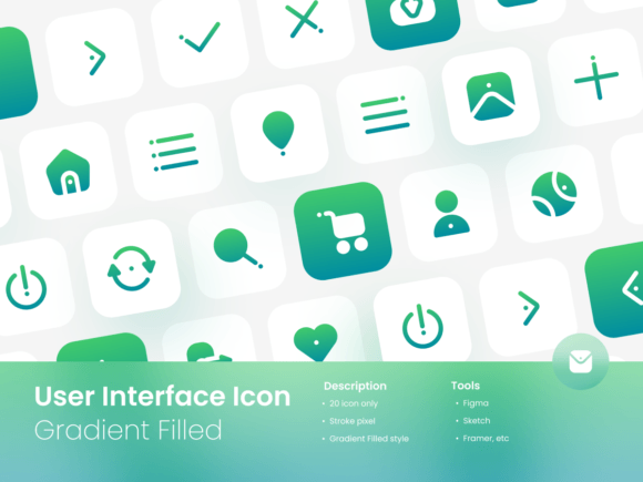
A clean, cohesive set of icons is one of the most powerful tools in any digital designer's toolkit. When you find a well-crafted User Interface Icon Set Gradient Filled, it promises not just visual appeal but also efficiency. This particular style, featuring smooth color transitions within each icon, adds a modern, dynamic feel to interfaces, websites, and presentations. People are drawn to these sets because they offer a ready-made visual language that can elevate a project's professionalism without the time investment of creating custom icons from scratch. However, the journey from downloading the ZIP file to successfully implementing the icons is where many subtle mistakes happen, undermining the potential benefits.
Overlooking File Formats and True Customization
A common initial excitement is seeing the list of included files: Adobe Illustrator, FIGMA, EPS, SVG, and PNG. It's easy to assume that having these formats means the icons are instantly usable in any scenario. This leads to a frequent oversight: not understanding the functional difference between the formats before starting your work. For instance, if you are building a website and plan to use the PNG files because they are "ready," you might later discover that you need to change the gradient color to match a rebranding. PNGs are raster images; you cannot edit the color or shape. You have locked yourself into a fixed design.
The practical advice here is to always plan with the source vector files in mind. The SVG and Illustrator files are your keys to true customization. Before you even place an icon, ask yourself: "Do I need this to be adaptable in the future?" If the answer is yes—which it often is for websites, apps, or brand materials—your workflow should begin with the SVG or EPS file. Import this into your design software (like Figma or Illustrator) and make your color, size, or minor shape adjustments there. Then export it to the format you need for implementation. This preserves the "Easily change the color" feature promised by the set and saves you from a frustrating, pixelated redesign later.
Misjudging Scale and Context
The feature "Easily change the size" is technically true for vector files, but it's misunderstood as "scale to any size without consideration." A gradient-filled icon, when scaled down to a very small size—say, a 16px favicon for a website—can lose its visual impact. The subtle gradient might become a muddy blob, and the detailed shape might become indistinct. Conversely, scaling it up massively for a poster might make the gradient appear too simplistic or stretched. The mistake is applying the same icon across radically different contexts without evaluating its readability.
To avoid this, test the icons at their intended final sizes early in your process. Open the SVG file and create artboards or viewports at the exact pixel dimensions you will use. Check the icon's clarity on both light and dark backgrounds if using PNGs with transparency. A better approach is to use the icon set as a foundational style, but not a rigid solution. For extremely small contexts, you might need to simplify the icon by using a solid version derived from the same set (if editable) or choose a different, more minimal icon. For large print contexts, ensure the gradient is smooth by checking the vector file's integrity at high resolution. This contextual evaluation ensures the User Interface Icon Set Gradient Filled style enhances communication, rather than obscuring it.
Assuming "Drag and Drop" Means No Integration Work
The phrase "Easily Drag and Drop" can create an expectation of zero friction. Many beginners, especially those using presentation software or basic web builders, might drag a PNG icon onto their canvas and think the job is done. What's overlooked is integration: does the icon's visual weight match the surrounding text? Does its gradient color palette clash with your existing brand colors? An icon dumped onto a slide without alignment with other elements can make a presentation feel disjointed, not polished.
Helpful correction involves treating icons as components of a system. After dragging an icon into your project, the next steps are crucial. Adjust its size so it balances with your headers and body text. Use your software's alignment tools to ensure it sits precisely within grids or alongside other icons. Most importantly, use the editable color feature to align the gradient with your project's color scheme. Perhaps your brand uses a blue-to-teal gradient; you can modify the icon's vector fill to use those exact colors. This active integration turns a dragged-and-dropped asset into a cohesive part of your design, boosting the perceived quality and usability of the final product.
What to Check Before You Commit to Using the Set
Before you finalize a download or start a project with a User Interface Icon Set Gradient Filled, pause for a few specific checks. First, verify the license terms, even if it's a free or purchased set. Can you use it in commercial client work? Are there attribution requirements? This avoids legal complications later. Second, open the sample SVG or Illustrator file directly—don't just look at the PNG previews. Check if the gradients are truly editable as separate vector objects. Some sets might pre-flatten gradients, making color changes more difficult. Third, assess the icon semantics: do the 20 icons cover the core actions and concepts you need (like settings, user, download, search)? A set with beautiful gradients but missing a critical icon for your app will force you to mix styles, harming consistency.
Finally, consider the long-term. If this project will evolve or be part of a growing brand, the customizable vector source files are your greatest asset. A set that offers only PNGs might solve a short-term need but become a cost later when you need changes. By choosing a set with robust source files and applying it with an eye for context, scale, and integration, you leverage the gradient-filled style to create interfaces and communications that are not only attractive but also adaptable and professionally coherent. This thoughtful approach turns a simple icon pack into a valuable, lasting design resource.